StackOverflow is a blessing. It's a career maker and a career saver for almost every software engineer I know, myself included. That said, it can be better.

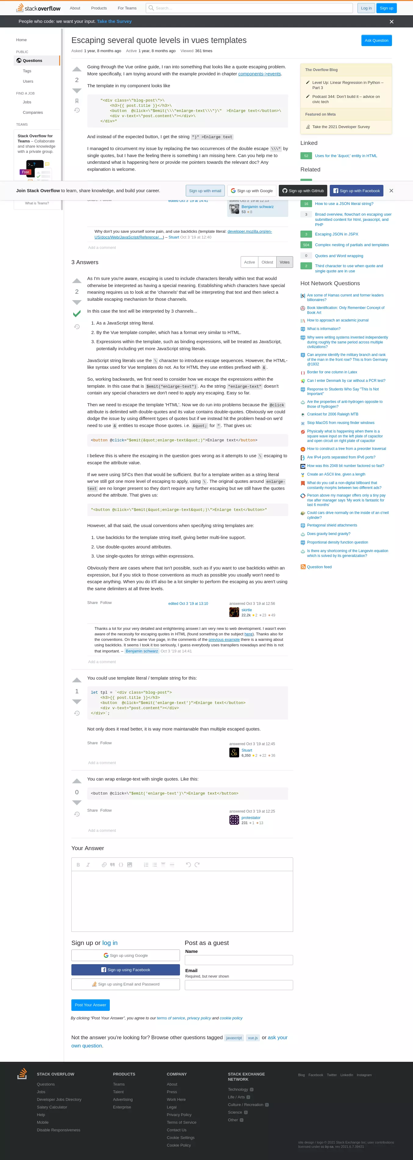
The vast majority of StackOverflow usage at work, at least for me, is looking for solutions that exist already. I don't need the account features (it has been months since I've logged in). I land on the question's page from my search engine, and bounce when I am done. I am only concerned with the content of the question and the proposed solutions, and perhaps any similar questions that might be relevant. Along with these, however, this is everything a StackOverflow page presents:
- A header with a search box I don't use, and links to 'About', 'Products', 'For Teams' and account-related actions.
- A form to answer the question.
- A link to the developer survey.
- A footer with a whole lot of other stuff.
- Cookie pop-ups.
- Another popup at the bottom urging you to join StackOverflow.
- An ad for StackOverflow for Teams in the left sidebar.
- Options to search for Jobs and Companies in the left sidebar.
- Links to the general Questions, Users, and Tags pages in the left sidebar.
- Links to posts on the StackOverflow blog.
- "Hot network questions" from across the StackExchange forums.
The average StackOverflow page looks like this:

Here's how you can strip away the extraneous elements and keep only the content.
-
Install uBlock Origin. Most people have this installed already. If you don't, what are you waiting for? It makes the web much less hostile.
Aside from its excellent ad and tracker blocking, uBlock Origin has a powerful feature called cosmetic filtering. This allows you to change the appearance of a website at will. You could render a website in a dark theme, or with any CSS of your choosing. Or better, in this case, you will purge (the official term is 'zap') any DOM elements you don't want to see on the page. Here's how.
-
After installing uBlock, click on the settings icon

-
In the tab that opens, click on My Filters on the top bar.
-
Add the following lines to the text box:
! 2021-06-07 https://stackoverflow.com stackoverflow.com##.top-bar__network.js-top-bar.top-bar stackoverflow.com##.js-consent-banner.r16.l16.b16.bar-lg.fc-white.bg-black-750.sm\:p16.p32.sm\:w-auto.ws4.z-nav-fixed.ps-fixed.ff-sans stackoverflow.com##.ps-relative.js-pinned-left-sidebar.left-sidebar stackoverflow.com##.sm\:as-end.sm\:order-first.sm\:mb12.sm\:ml0.print\:d-none.grid--cell.aside-cta.ml12 stackoverflow.com##.m0.p0.d-block stackoverflow.com##.tex2jax_ignore.module stackoverflow.com##.js-dismissable-hero.z-nav.b0.r0.l0.ps-fixed.bc-black-100.bt.bs-sm.bg-black-025 stackoverflow.com##.js-footer.site-footer stackoverflow.com##.post-form.js-add-answer-component stackoverflow.com##.bottom-notice stackoverflow.com##.py2.fs-body2.ff-sans.fc-white.bg-black-700.js-announcement-banner -
Click on 'Apply Changes', close the tab and try opening any StackOverflow page.
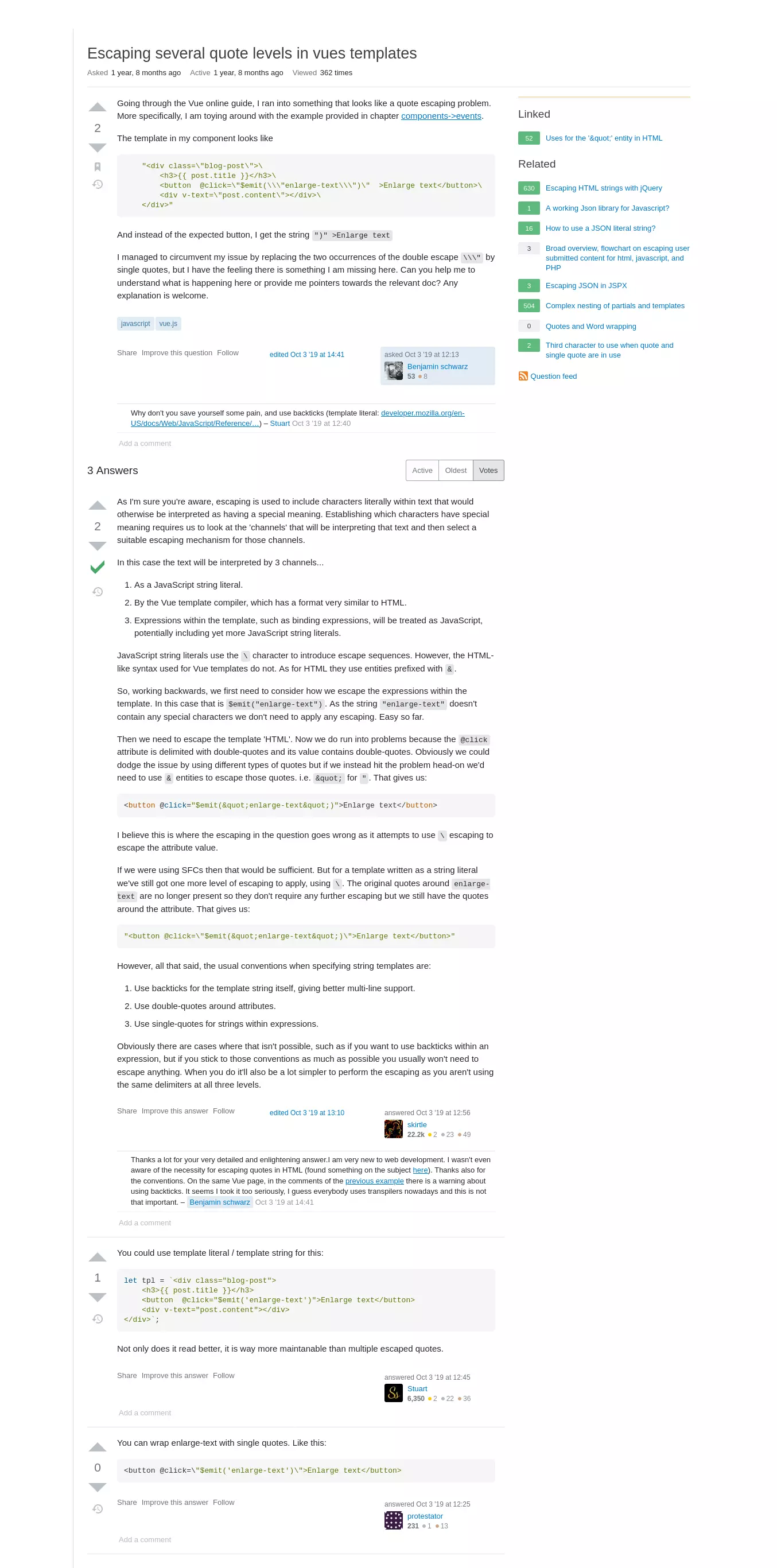
This is the result:

It is much cleaner, shows only the relevant information and offers no distractions whatsoever. Troubleshooting your code has never been more pleasurable.